Yield management systems offer a multitude of benefits to semiconductor manufacturers and fabless companies. To achieve manufacturing excellence, being able to quickly access and analyze all the data is key. For that reason, yield analysis software is an absolutely essential investment, benefiting not just yield engineers but all levels of management across the corporate structure.
Yield analysis software is used for storing, tracking and analyzing all the data collected during chip manufacturing and testing, with the aim being to identify potentially quality compromised devices, improve yield and increase productivity.
One of the central functions of a yield management system is data visualization.
Data visualization
The many integrated visualization and calculation tools of data analytics software give a thorough understanding of the manufacturing process and its enhancement possibilities.
As one of the most important tools for yield and test engineers, data visualization encompasses a wide range of visualization tools such as wafer maps, trend charts, correlation charts, histograms (grouped/stacked), line charts, pareto analysis, fail flip maps, fail trends, fail category maps, gallery views and many more.
Wafer maps
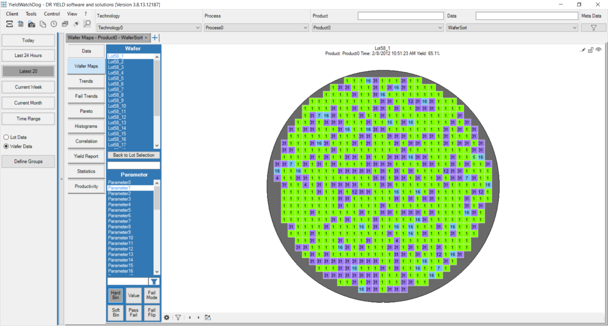
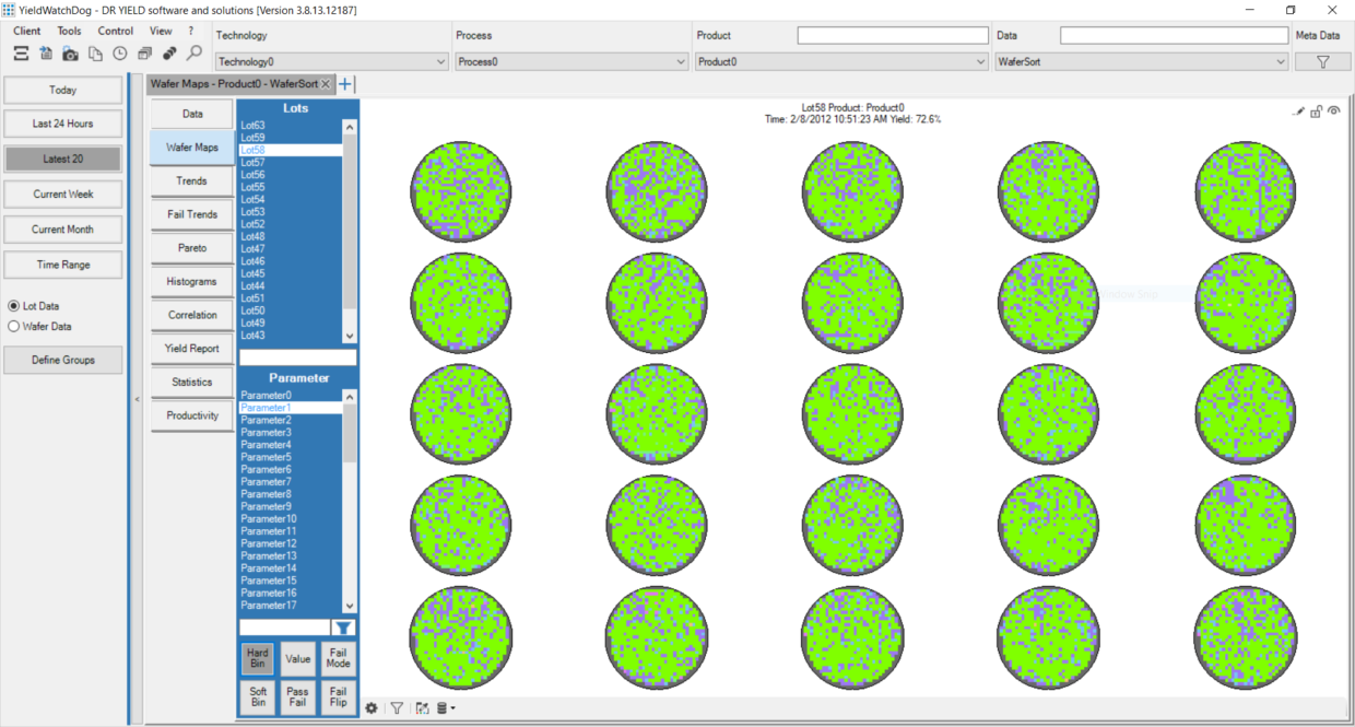
Wafer maps visualize parametric measurements by coloring the dies according to the measurement values. This allows the users to detect different patterns on the wafers. Using the fail category maps, parametric and non-parametric fails are shown in a single map. This allows analysis on a global level.
In addition to standard wafer maps, pass/fail maps, soft bin maps, fail flip maps and defect overlay maps can be shown in yield data analytics software.
Fail mode maps indicate which parameters fail on which positions on the wafer.
Soft bin maps in the software represent the second set of bin information for each chip.
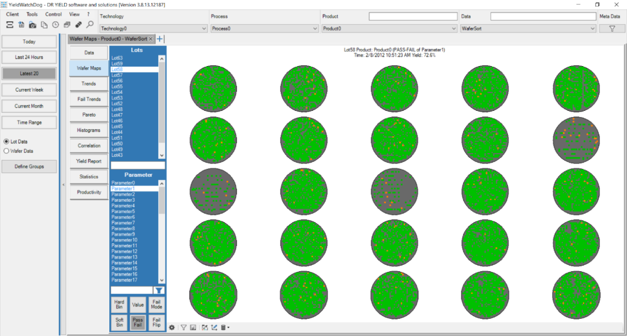
Pass-fail maps display failed chips for selected parameter with a respective color chosen by the user. It indicates that the selected parameter has violated the specification limits.
Fail flip maps are used to display chips that changed their pass/fail status during multiple tests.
All wafer maps can be displayed as a single wafer map (Figure 1. Single Wafer View) or as galleries (Figure 2. Wafer Maps Gallery). It is possible to customize and zoom into any map in different ways. By clicking on any specific die, you can retrieve all meta information (coordinates, site information, part id or other meta data) from that die.
It is also possible to stack selected wafer maps together and aggregate the values in different ways. This enables analysis based on the spatial location of a certain die.
Figure 3. shows the Pass-Fail map for the selected parameter. Failed chips are marked with a special color (in this case orange) to indicate that the selected parameter has violated the specification limits.
Trend charts
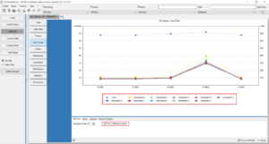
Trend charts can be used to analyze how a certain test parameter behaves in time. The monitoring can be made per lot or per wafer.
To detect potential problems correlated to equipment, spatial region or other meta data, the trend charts can be split up accordingly.
Box plots can be used to better visualize how the data is distributed.
By using Statistical Process Control (SPC), data-driven control limits can be automatically calculated and displayed.
Additionally, automated alarms can be sent out if some trend data point exceeds a spec or control limit.
Correlation
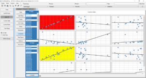
By using correlation charts, test and yield engineers can observe how similarly two different test parameters behave. A 2D scatter plot is drawn where the test parameters are used as X and Y axis. By applying line fitting approaches, the coefficient of determination (R²-value) can be computed.
Fail trends
Fail trends display a summary of the recent yield and failing parameter trends of the lots matching your product and time range selection.
Histograms
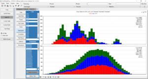
In semiconductor data analytics software, a variety of histogram views can be displayed, including in multiple galleries or as split lot analysis. Histograms help visualize the data distribution and detect outliers. The data analysis can also be made by spatial regions or sites.
Pareto analysis
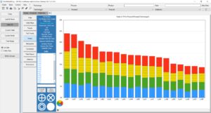
Pareto analysis can be used to detect which test parameters or bins lead to the most significant fails and to identify the core problems within a production workflow.
Some types of Pareto charts implemented in yield data analysis software are fail modes, color coded fail modes, yield loss, random yield loss, systematic yield loss, D0, defect induced parametric yield loss (DIPYL), fail flips, hard bin, soft bin, stacked hard bin bars, stacked soft bin bars, custom bin Pareto and waterfall chart.
Each of these types serves a specific purpose in semiconductor test and yield data analysis.
About DR YIELD software & solutions GmbH
DR YIELD provides the leading-edge advanced analytics software YieldWatchDog for analysis and control of semiconductor manufacturing and test data. This enables semiconductor manufacturers as well as Fabless companies to improve important manufacturing dimensions such as equipment availability, throughput, operating costs and yield. Once installed YieldWatchDog allows you to get actionable insights into your data. For detailed information click here.

